Role
User Research
Product Strategy
Wireframing
UX Design
UI Design
Tools
Sketch
InVision
Miro
Timeline
2 months
The Problem
Working people face many tasks in their lives, have goals they want to achieve and often they don't know where to start or where to find the time. Although they try hard and do more to get everything done, their task lists get longer and longer. They get overwhelmed and frustrated. Even if they have tools like task apps available to support them, they end up with endless lists that get forgotten and feel highly frustrated.
Hypothesis
Faced with these problems and finding myself in this situation, I saw the potential for an app that would support more than just by having a list of tasks. Based on further research, such as talking to people, analysing prioritization concepts and tools, I derived the key assumptions that people want to regain more overview and control over their capacities and that this can be an outcome of focussing on the essentials, supporting them in prioritising with their goals in mind and motivating them during their process.
The Solution
My approach is based on the concepts of Dieter Rahms ("Less, but better.") and Greg McKeowns book "Essentialism", which advocate focussing on few, but the right, useful things and let only those in your life that pay off on your goals.
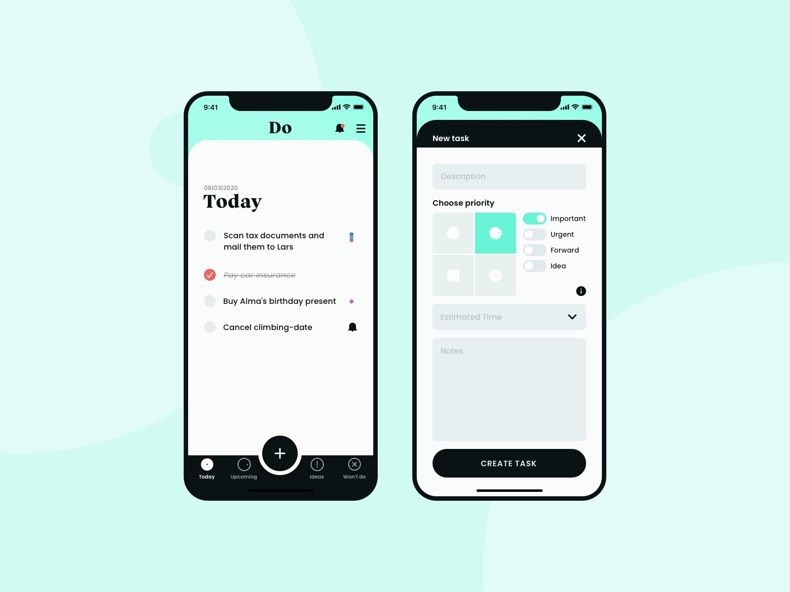
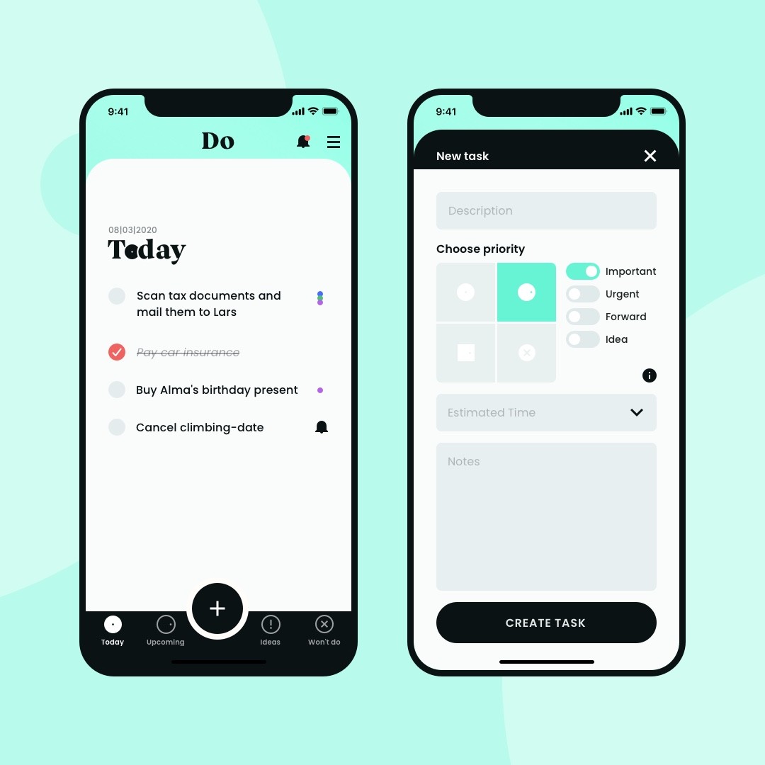
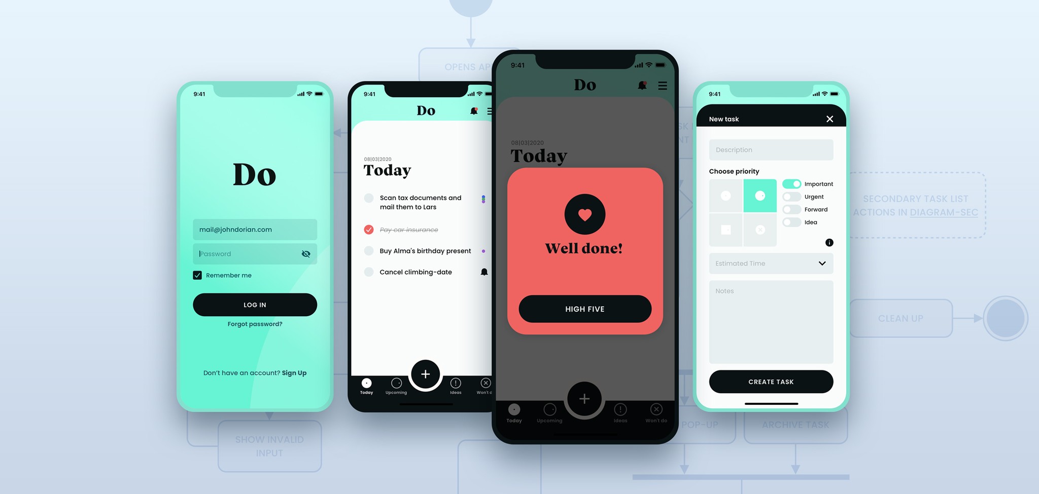
Following those concepts the implementation, which I decided is a task app named "Do", shows the primary features of having one single focus, prioritising tasks inspired by the Eisenhower matrix and motivating support through the app.
Especially during prioritizing users are jumping into a reflection module helping them to validate through three main questions, if a task is about their focus, if it is important right now or if they just don't need to do it. Depending on users' workload and task tracking the app will friendly prevent them from getting stuck or lost with a certain intelligence behind.
The Outcome

User Research
Since I myself was in the situation of having too many tasks and projects at the same time to achieve personally important goals, I was interested in how others deal with similar situations and how they feel. So I've talked to different people about their everyday life, how they organise themselves to achieve their goals and whether certain tools helped them to do so. Three main problem clusters emerged: Many tasks but little time, lack of focus and the lack of useful tools.
User frustrations
To get to the heart of the problems that arose from the conversations and to reveal the needs of the target group, I defined user frustrations with the syntax [situation], [response], [problem to persona].
Gap between time and amount of tasks
People who are very busy at work and in their private lives are facing a large number of tasks, especially if they want to pursue further goals, which they cannot fully manage in their available time.
Lack of focus
When people have to manage many tasks in different areas, they feel overwhelmed and find it difficult to focus on the essentials.
Tools do not meet the needs
When people want to organise their many tasks, they often look for mobile task apps, but they give them little support beyond list functions.
Concept Research
To find inspiration for possible solutions, I searched for existing concepts that deal with time management and prioritisation in life. In particular, I came across Greg McKneown's approach of essentialism, which is very close to Dieter Rahm's design principle of "less but better", and the Eisenhower Matrix, a prioritisation tool.
The main principles of essentialism
Greg McKeowns' concept of essentialism moves very close to Dieter Rahms' design principle of "Less, but better". He advocates setting concrete goals, focusing exclusively on the tasks that pay towards these goals and eliminating the rest according to the premise "If it’s not a hell yes, it’s a no!" He particularly emphasises subtraction, which means doing less but implementing the important things. In addition, he attaches great importance to motivation through making success visible in order to develop this routine.
The Eisenhower Matrix
The Eisenhower Matrix is a time management tool and an aid to prioritise tasks. It maps the 4 priority levels onto an importance-urgency scale: do it yourself immediately, do it yourself with a deadline, delegate, don't do it.
Competitor Benchmarking
To get an overview of existing products I researched task and time management apps for my further procedure. A few were based on the concept of the Eisenhower Matrix, but were rather a copy of it. None of these apps worked with any form of task limitation, accompanied prioritisation or even other forms of motivational support. A lot of them mirrored simple flat task lists.
Problem Space
The core problem has proven to be that people with a lot of responsibilities are so overwhelmed by the high amount of tasks in their life that they can no longer distinguish relevant from irrelevant tasks. Trying to complete all the tasks in their given time, makes them unable or slow to reach their goal and experience great frustration and stagnation in their lives.
To focus on initial ideas for solutions, taking this problem into account, I formulated how might we statements.
How Might we make it easier for people to achieve their goals even though they have little time?
How can we enable people who face many challenges to distinguish important from unimportant tasks?
How can we help people to get out of frustration and motivate them?
Assumptions
Based on the research observations I've defined hypotheses on how to dissolve the identified user frustrations. The syntax for those is: We believe that [creating the experience] for [persona] will [achieve this outcome for the user].
We believe that people experience more motivation and joy in what they do when they do fewer but important things.
Ideation
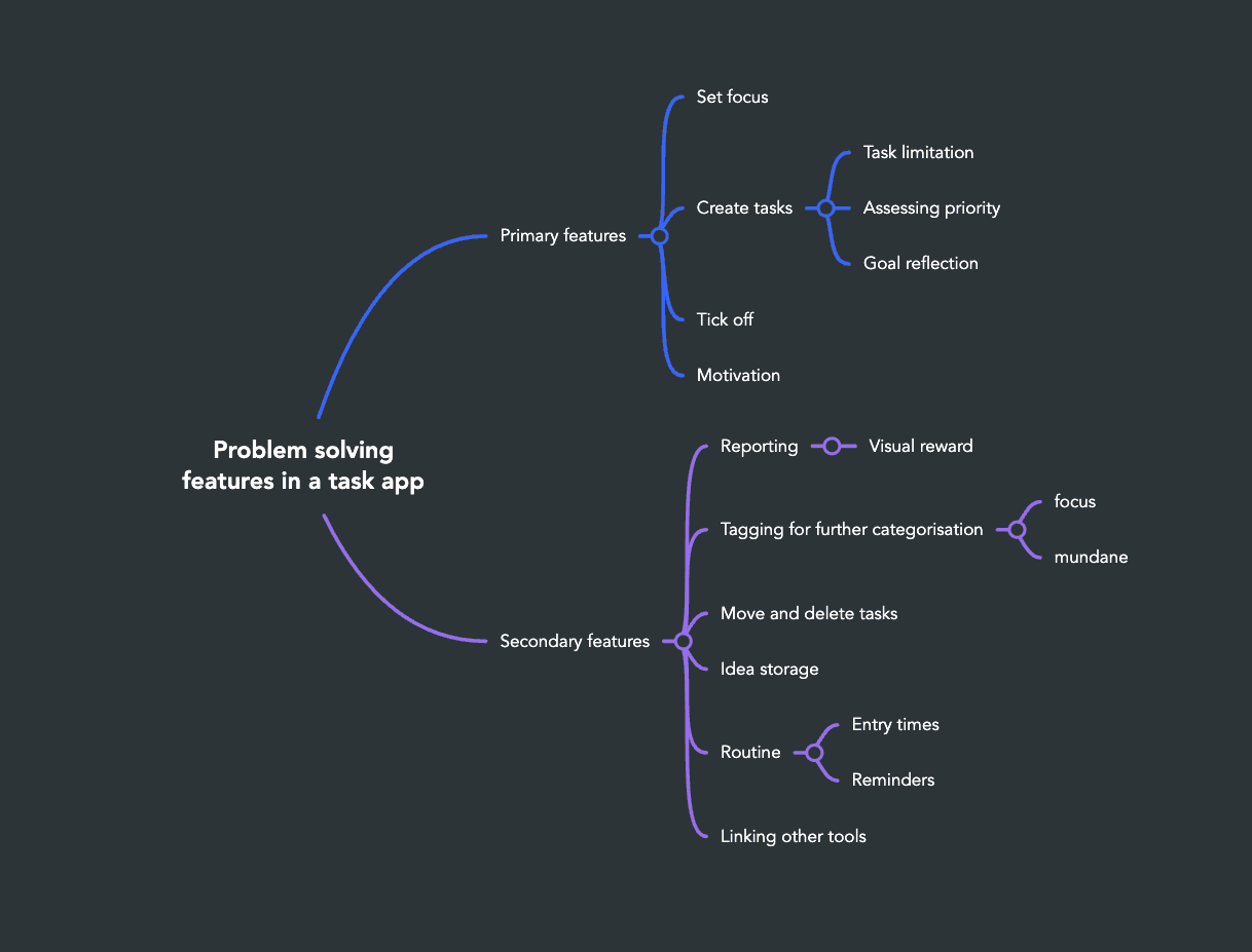
With this research and the assumptions in mind, I mapped out ideas for solutions by asking, what features and functions a product should have to fulfill users' needs. At this point, I decided to outline the solution for a mobile device, as many people own a smartphone and apps are a very handy format for mapping tasks. The result of my ideation was an overview of potentially useful primary and secondary features.
Primary features
Set a focus to be able to create tasks.
Create a task and ...
... enter the time needed for an automatic task limit per day.
... select the priority with the help of the Eisenhower-Matrix.
... optionally run a reflection module (select & eliminate) with guiding questions to validate the match between task and focus as well as task and priority.
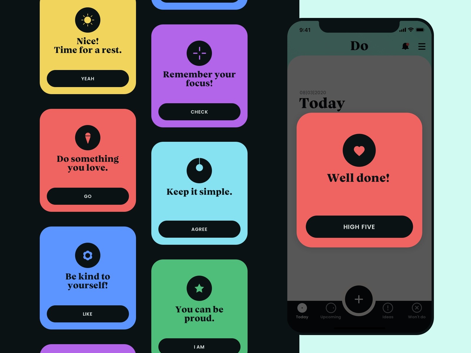
Get motivating pop-ups based on tracking of different categories e.g. progress, number of tasks, "task jams".
User Flows
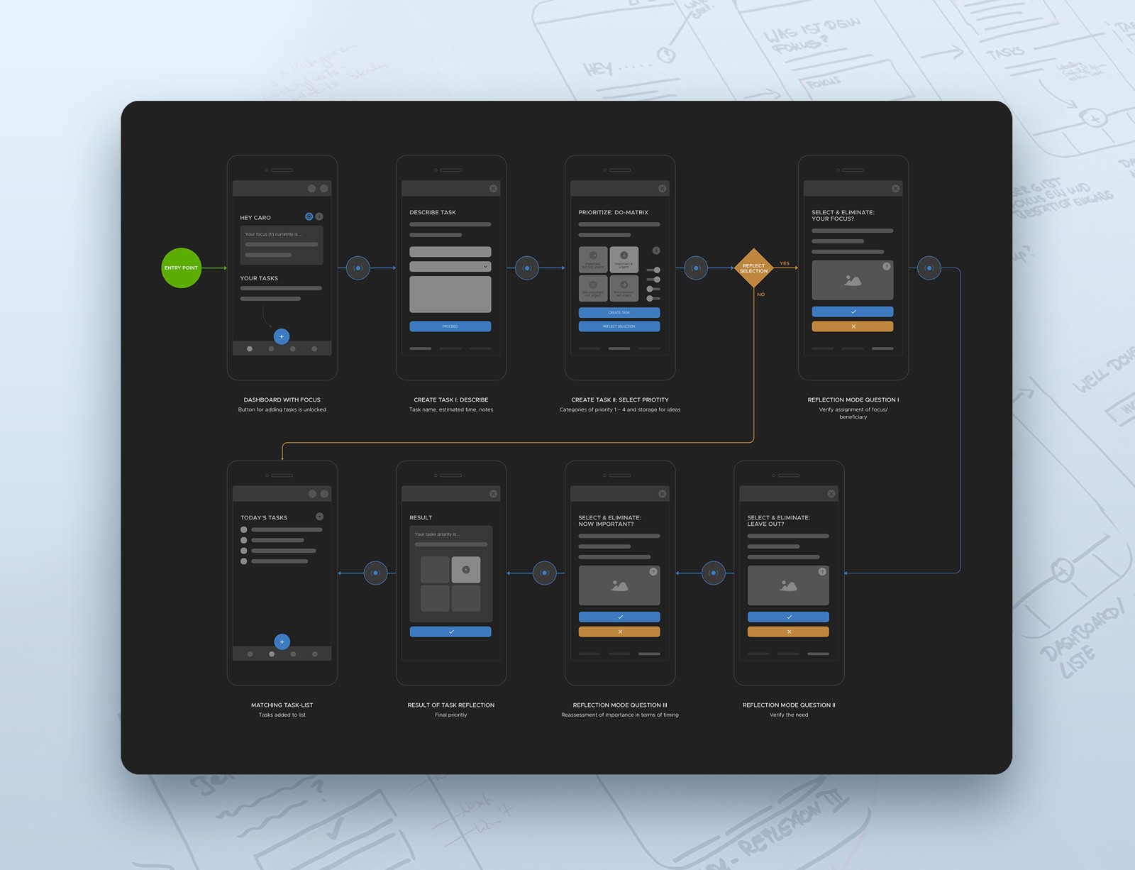
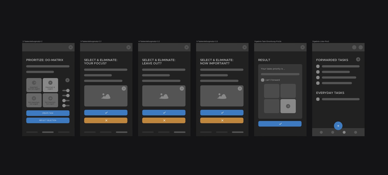
Focussing on those primary features needed for the target group to reach its goal, I created user flows based on the "happy path" of potential users, which means a simplified flow with successful result. To get a better idea of how the ideas can be mapped into a product I further elaborated them as wireframes and wireflows.
The key feature
The outstanding key feature in the sketched task app is the task reflection module. If users are not sure about the priority of a task, they can launch the module. It allows users to check the task for its relevance to their focus. This is done by answering the following three reflection questions:
"Is it your focus?"
"Imagine: Can you leave it out?"
"Is it important now?"
Depending on the priority of the task within the matrix, the task is deleted or added to one of four corresponding task lists for today, upcoming, forward or delete.
Branding & UI Styles
After the elaboration of the primary user flows, these should be tested in a discussion with potential users. Nevertheless, I first thought about a brand and the UI styles to approach a first look of the high fidelity prototype and to give users a concrete idea of the product.
Brand Adjectives and Moodboard
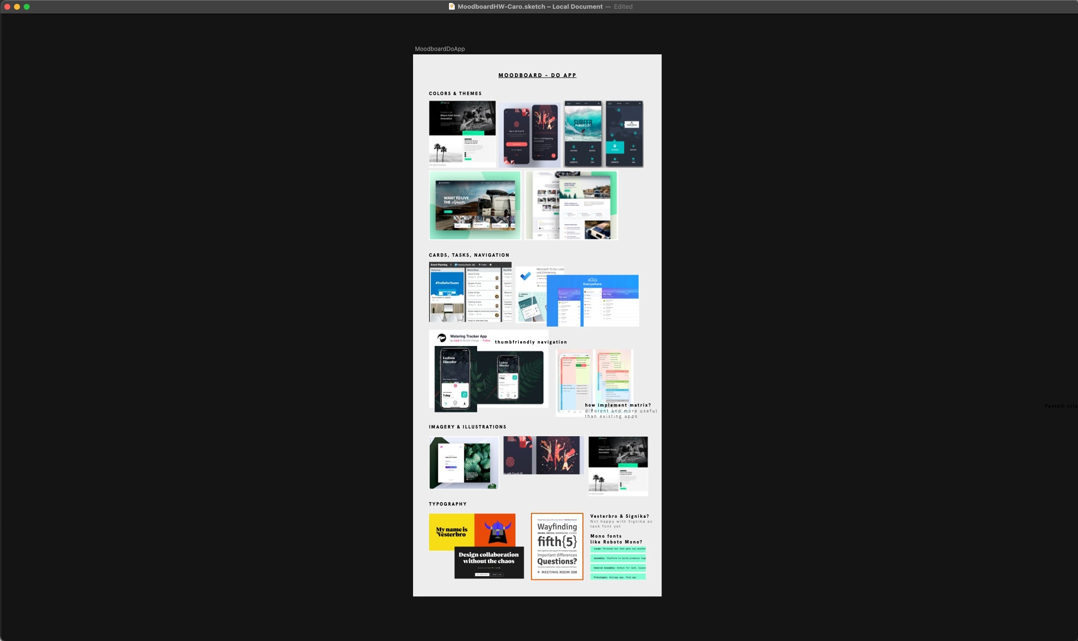
I first collected brand adjectives, such as simple & essential, fresh, innovative & offbeat, confident & positive, since the outlined product is especially about simplifying and focusing the relevant, and then created a moodboard.
The Brand
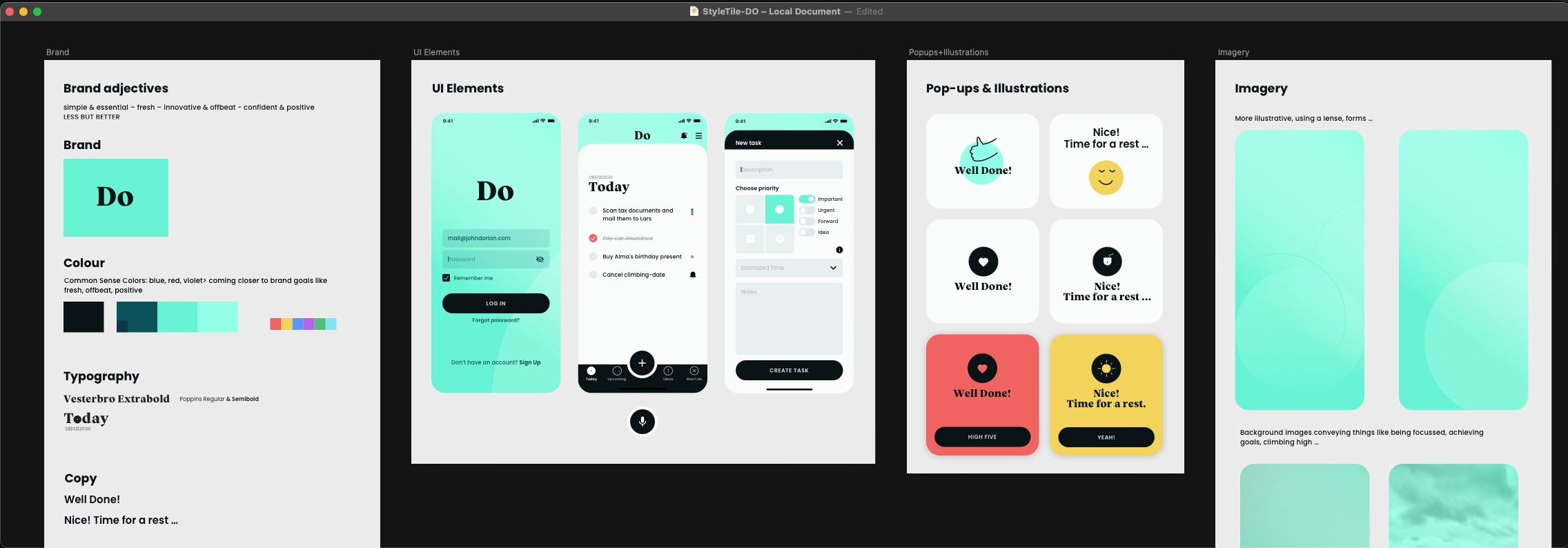
With these brand adjectives in mind, I created a style tile and first brainstormed some product names. Very quickly I decided on the evocative but motivating and simple name Do.
Colour Styles
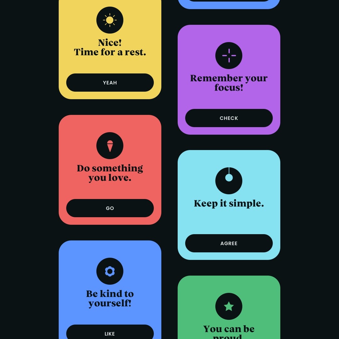
Similarly, I decided on a very fresh, unobtrusive teal as primary brand colour and to keep it simple just combined a greyscale and black as basic colours for surfaces, texts and action buttons. Just for the motivation pop-ups and further accents I choose a more colourful palette which is used only very reduced. This colour composition especially underlined the adjectives fresh, offbeat and positive.
Font Styles & Copy
To achieve a very simple, clean and open typeface I chose Poppins as basic font, which is a well readable geometric Sans Serif. I combined it with the modern serif Versterbro (trial) font coming closer to a slab font it has a friendly, positive and exceptional feel rather for a restrained use in headlines and short statements. Finally, I also collected examples of appealing and motivating copy.
Focus Group Discussion
With the primary wireflows and a first design I jumped into another discussion with my target group I've talked to during research to collect user feedback for the next iterative steps.
Discussion outcomes
During the discussion about the key features and first designs, I faced a lot of positive feedback especially on the designs and the supportive reflection module. This general interest in the key feature leads to the assumption, that the product could deliver further benefits to users such as an improved estimation of own capacities.
Three key learnings
1. There is a general interest to test the product features.
2. The target group is assuming several benefits with an app like this.
3. Users prefer very simple and clean design approaches.
Next steps
Next iteration steps will be to build a high fidelity prototype and to further validate the assumptions through usability testing with the target group.
