
Role
User Research
Product Strategy
UI Design
Interaction Design
Usability Testing
Tools
Figjam
Notion
Maze
Figma
Loom
Timeline
5 weeks
The Problem
In the current cold shower challenge experience in the Wim Hof Method® app users are confronted with overloaded screens that lack visual hierarchy and are left with no additional information or guidance where to start or continue their journey. They find some engaging elements such as collecting badges, but no connection to the personal benefits that come from participating in the challenge. As a result, users easily get lost during the experience and confused by numerous interruptions, which bears the risk of dropping out early without being interested in conversion.
The Solution
In our solution, we focused on the user's need for more guidance and orientation during the experience. With that in mind we delivered a higher level of visual hierarchy and improved the structure of several screens by creating a highly consistent and accessible UI style and components library that illustrates different categories of content information, especially through the use of card elements. Additionally we improved the UX writing in headings and CTA buttons and added further instructions on where to start and continue the cold shower challenge, addressed personally to users by Wims' avatar, as well as a quick onboarding process.
Assuming that the measures outlined and the simplification of the process would help users to find their way through the journey easier and be motivated while doing it, we conducted a usability test which revealed, that we were able to accomplish an improved and satisfying experience in this context.
But the testing also proved further iteration is needed to engage users to conversion and provide a better understanding of the purpose and benefits of the method. We have already anticipated in the case study that this can be improved by adding personal value to the cold showers results. Therefore, one of our ideas that we will come back to is to add useful outcomes for the personal well-being and health of the users, by filling in an evaluation questionnaire after each shower. Other than that we will spend more efforts on habit building to support further engagement.


Usability Review
To get a good understanding of the product and emphasize with the users we conducted a usability review analysing the pain points and the wow moments of the cold shower challenge flow.
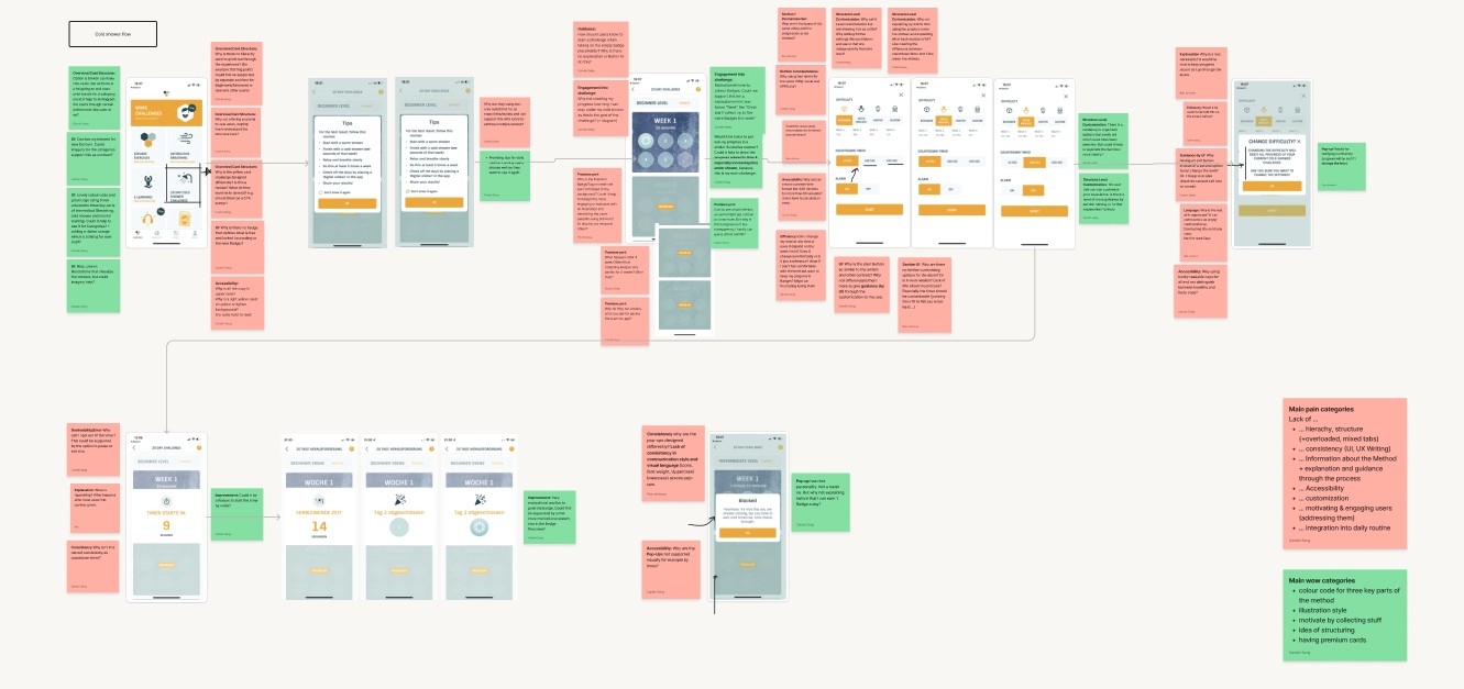

Business & User Frustrations
Based on the observations in the usability review we identified several user as well as business problems. To better frame the frustrations uncovered, we have summarized them into three main frustrations that follow the pattern: When [situation] users are [response] which results in [problem to business or user].
Primary Frustration
When running through the cold shower challenge flow users are facing overloaded screens with visually undifferentiated and unexplained options, which results in confusion about where to start or continue the experience.
Secondary Frustration
When running through the cold shower challenge flow users are left alone without additional information about the method that will guide them through the process, which results in users getting lost during the experience and potentially leaving the app out of frustration.
Tertiary Frustration
When running through the cold shower challenge flow users are not engaged and motivated to understand the benefits of the challenge which results in not being motivated to form a habit and thus not being interested in the premium version
Competitor Benchmarking
With the identified issues in mind we analysed direct and indirect competitor products that focus on healthy exercises, challenges and timers. We intended to find inspiration for improvements or additional flow elements and to reveal possible solutions or even common standard patterns for the problems in the current user flow.


Next to Cold water therapy and Duolingo app, especially the Guided Breathing and the Breathwork app explain the first steps during onboarding and have clearly structured overview, settings pages and homescreens. Throughout the whole experience users are guided by consistent use of styles and personalized, motivating UX Writing and call-to-actions.
Two inspiring aspects to outline of the Breathwork app are the different kinds of card components used for different exercise categories such as habits or challenge cards, and the use of the homescreen as a personalized dashboard.
Problem Space
The problem identified is a mixture of firstly a lack of structure and orientation in the process, compounded by inconsistent use of fonts and communication as well as accessibility problems, and secondly supporting and appealing information about the method. As a result, users maybe don't understand their personal benefits of the cold shower and why they should develop it as a routine that can only be continued in the premium account. Apart from collecting badges, no other efforts are made to arouse interest in the subscription.
From this problem space, we formed "how might we" statements as a starting point for iterating initial solutions:
How might we provide more orientation and clarity to users on how to start the shower challenge?
How might we give users more information so that they are motivated to start and finish their first challenge and understand the process?
How might we make it more satisfying and engaging for users to start and continue the challenge ?
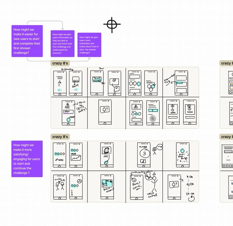
Ideation
To uncover a broader range of ideas, we created a mind map of what we could improve or add, followed by a crazy 8s session to generate unusual ideas as well and bring the written ideas to a visual level.
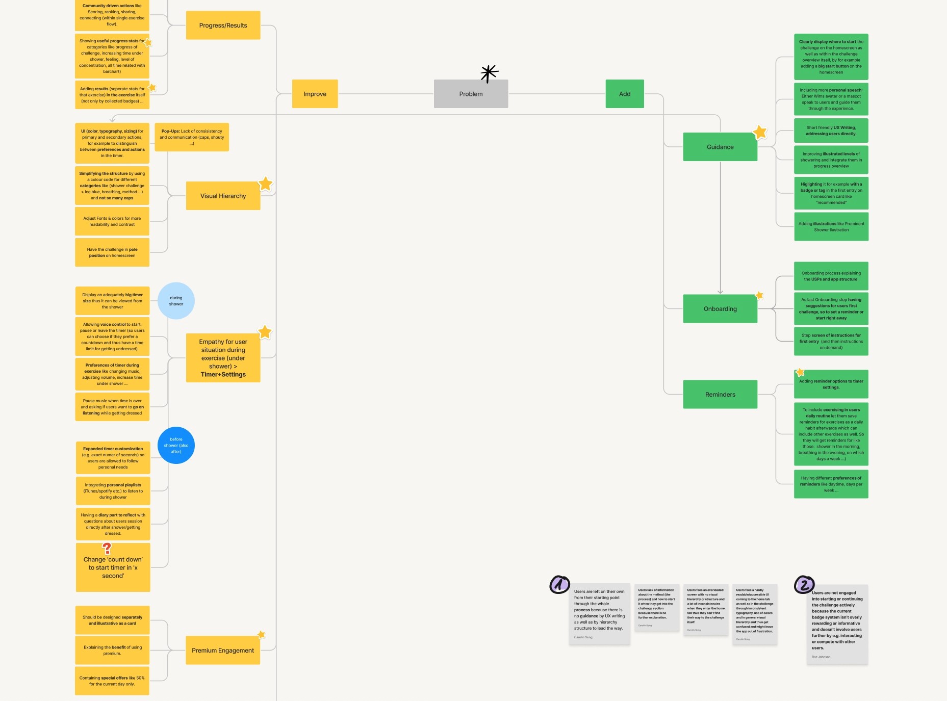
What can we improve
Refining the visual hierarchy through a systematised, consistent and accessible UI to simplify the structure at several points of the experience
Revising the timer and settings, such as expanded customisation, voice control, playing music, larger size to better suit the user's situation in the shower
Deleting the levels in the timer to reduce confusion
Including personal wellbeing outcomes in the challenge space so users can see the impact directly
What can we add
More guidance through the experience with short UX writing and personal adress Wim Hof
Pointing out where to start and continue by putting the most important elements first and using tag components to highlight them
Adding an onboarding process that explains the method, its benefits and suggests next steps to first users, e.g. start with the cold shower to give a deeper understanding of the method
Diary keeping to track different categories of personal wellbeing alongside simple progress and deliver useful stats about personal health effects
Creating feminders to support habit building

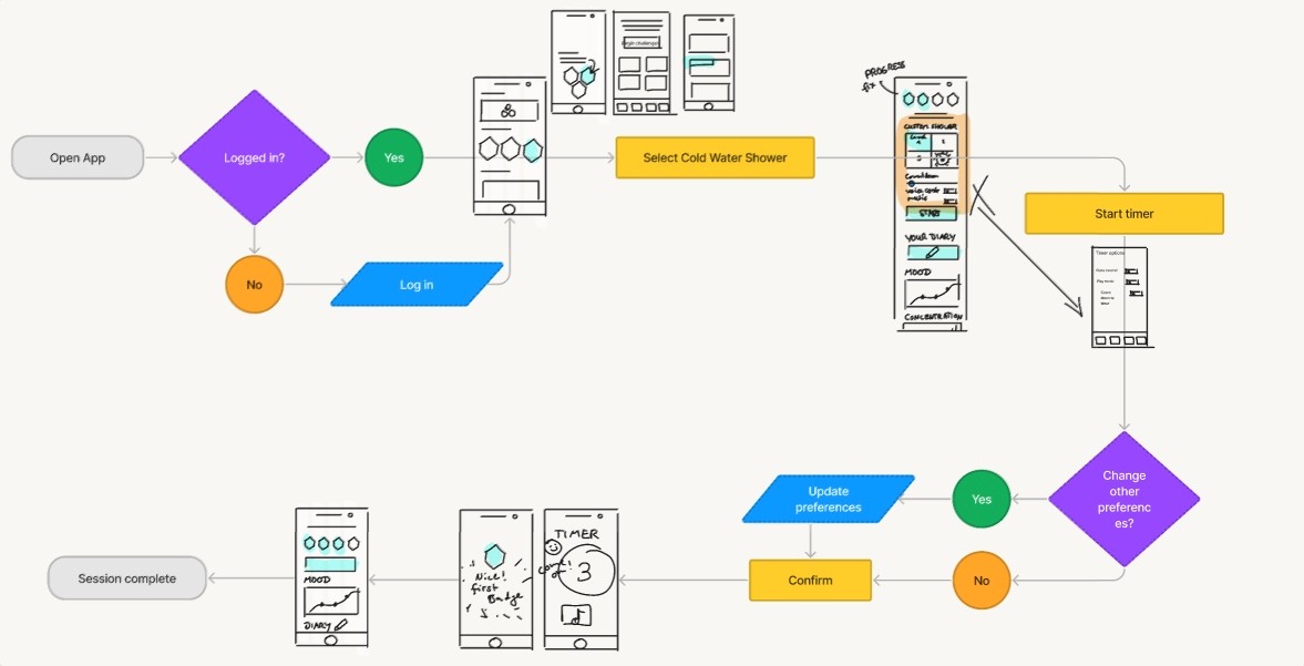
User Flows
After ideation, we created a user flow diagram of the current experience and built an improved version, integrating our previously outlined ideas into the flow. This gave us an overview of the wireframes we needed to create and also allowed us to identify a redundant loop that had interrupted the flow with a pop-up generated by changing the difficulty level.

Rapid Prototyping
Wireframing the flow made us aware of each step of each step of the enhanced experience and gave us a detailed overview of the screens, elements and components required. We were even able to create a list of the illustrations and text styles needed.

Styles & Components
Walking through our low-fi prototype we created all UI styles and components we needed especially to establish a fully consistent and accessible experience. The result was a library of highly reusable elements that enabled us to develop a hi-fi prototype very quickly.


UI Styles
In order to define consistent and accessible standards for the component set to be created, we first specified different style categories such as colours, texts, grids and shadows. For colour styles, the main issue was to change the primary action colour to a strong blue to meet accessibility standards, as opposed to before with yellow, which we defined more as a brand colour for restrained use. We also defined a neutral colour palette for surfaces, text and secondary actions, as well as a palette for accents. Taking into account the Wim Hof brand, we chose the typeface Overpass as it has a personal touch, still is clean and simple, and therefore appears less formal. As a baseline for screen design, we used a 4-column grid with the 4px rule in the vertical.
UI Components
Using the list of required elements created in the wireframing step, we had a very detailed overview of the components and their variants. Besides many standard elements such as buttons and controls, the component library mainly contains card and timer components. The animations focus on timer and progress components while the standard elements benefit more from microinteractions.

High Fidelity Prototype
We built the individual screens for each step of our flow and added more minimalistic page animations and micro-interactions. To better measure the impact of individual improvements during usability testing, we focused on simplifying the visual hierarchy, providing guidance through UI and UX writing, and reducing further confusion in the first prototype . The review questionnaire and journaling, as well as habit-forming interventions, were saved for the next iteration loop. Nevertheless, we consider these aspects crucial to make the purpose of the method particularly clear.
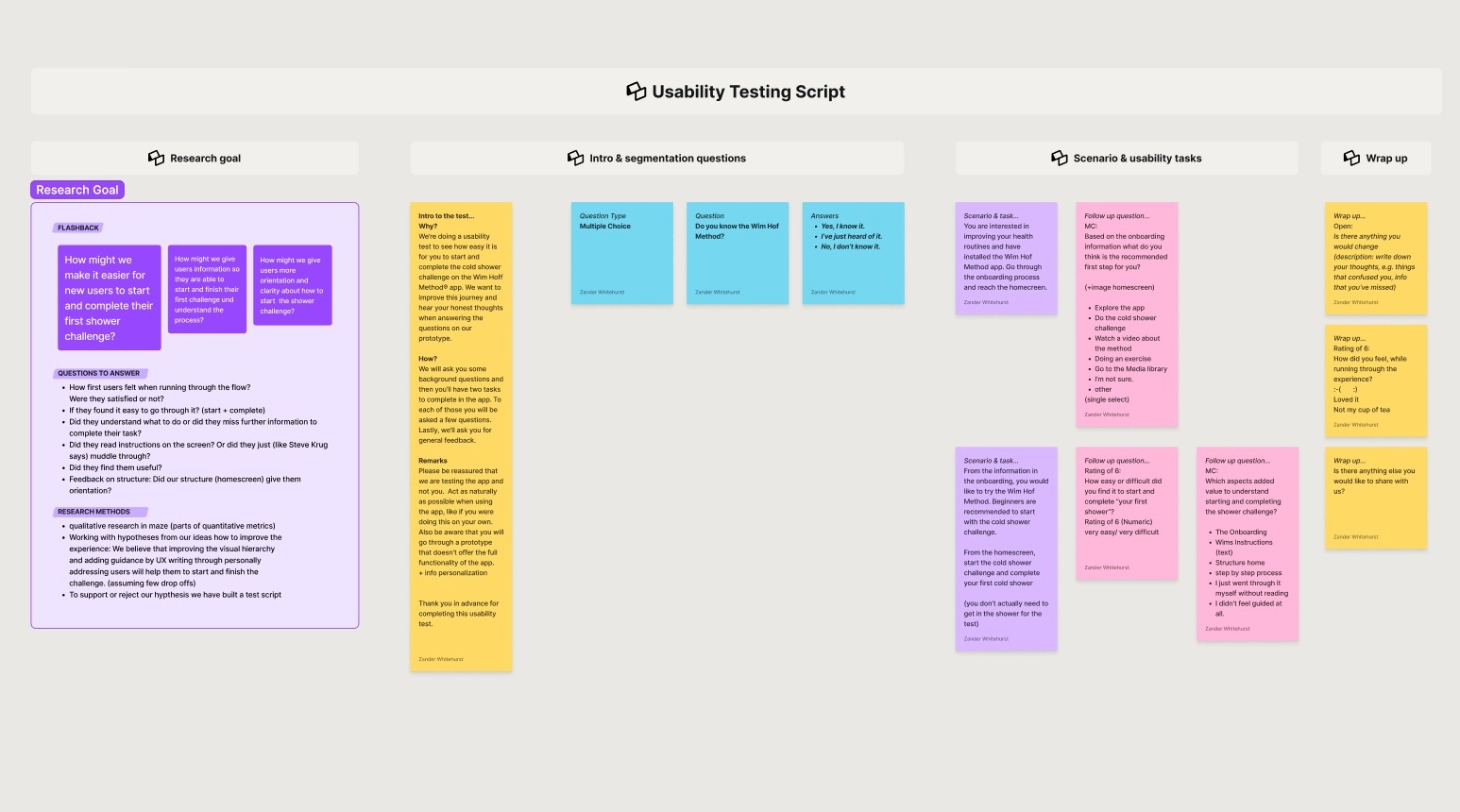
Usability Testing
Based on our assumption that the ideas implemented in the first step will guide users through the process and make it easy for them to start and finish the cold shower challenge, we conducted a usability test according to a test script.
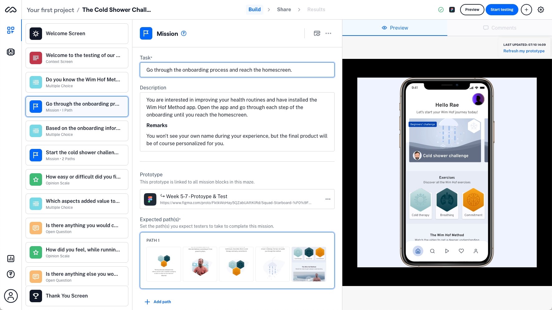
After an introduction to the test and a single background question, we outlined two scenarios and usability tasks to complete: 'Go through onboarding and reach the homescreen' and 'Start the cold shower challenge and complete your first cold shower'.
For each of these tasks, we asked a few follow-up questions to find out if users knew what to do, how easy they found the experience and what they felt most guided them through the task. In the final wrap-up, we asked for general feedback on what users missed and how satisfied they were with the experience.
Test outcomes
After testing the prototype, we learned that all users successfully went through the entire process (100% success rate without dropping off) and for the most part found it very easy and satisfying, which should improve users' first impression of the app to be positive and their orientation in the user flow as well as their ability to go straight through the challenge with less confusion and interruptions, compared to the original app.
Three key learnings
1. The structure of the flow supported by the text instructions as well as the clearly organized homescreen offered users the highest degree of orientation: 68% were guided by the step-by-step process, two two thirds of those (42%) also by the text, and/or 29% addtionally by the homescreen structure), so that refining the visual hierarchy and simplifying the flow structure were successful measures.
2. Users still do not understand the purpose of the method and doing the cold shower as a challenge, but show interest in learning more.
3. Users are unlikely to read even short text instructions, but instead skip each step (e.g. onboarding) and, as Steve Krug says, muddle through. This is underlined by the finding that most users were guided by visually aspects (90%) in the flow rather than text instructions (20%).
Next steps
In further iterations on the flow based on these results, we would concentrate our efforts on refining three aspects in particular:
We would shorten the instructions and guide the user more through keywords in headlines and buttons, so that the most important information is more likely to be found on elements of the UX that are visually easy to grasp.
Another measure could to put more effort into an engaging, but still short onboarding, explaining the method and its benefits on a strong audio-visual level. Other than that, we should also consider displaying a short explanatory video of Wim's method at the top of the homescreen instead of the cold shower challenge.
That being said, users are more willing to engage with features (and pay for premium content) if they understand the meaning and personal benefits behind. As mentioned in the prototyping section, the post-challenge evaluation questionnaire (journaling) and the tracking of health benefits, mapped out directly in the exercise as positive outcomes for users' personal well-being and health alongside progress are very important aspects for engagement. Therefore, we will take them up in the next iteration loop as originally planned.
In this context, it makes sense to focus more on habit building by adding reminders as an example of interventions to integrate the method into users' daily lives.

Finally, in order to consider new ideas, we questioned the use of a timer in the shower during the case study as well as two users did in the test. An alternative could be to outsource the timer to another device, such as a smartwatch app that can be connected to the mobile app.